

THE CHALLENGE
How can we mediate the dynamic of the most crime-prone area in Cincinnati?
CLIENT
MY ROLE
Cincinnati Police Department
Cincinnati Parks & Recreation Dept.
Student Designer
Collaborating with a team of 7 graduate students, a faculty member, an ex city ambassador and 2 policemen.
TOOLS
Adobe XD, Adobe CC, Whimsical
TIMELINE
5 months

Articulating the problem


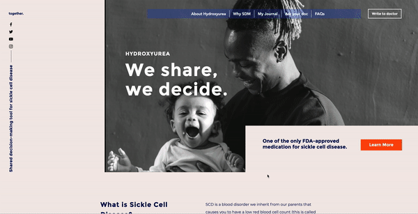
Introducing Cope

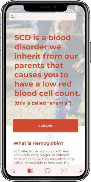
Cope is a health monitoring app for Sickle Cell patients and families to engage with everyday.
DAILY CHECK-IN
The homepage features upcoming appointments, tracks daily health fluctuations and provides a curated list of readings for the patient/caregiver.


COMMUNITY SUPPORT
Sickle cell patients heavily rely on community response and review of treatments. The community forum provides a support group beyond medical support from the hospital.

MONITORING INSIGHTS
Daily health monitoring provides insights about their experience with Sickle Cell Disease. It also contributes to fill the gaps in research about the subject.
LEARN THE LATEST
Bearing in mind the educational purpose of the strategy, the app provides a curated learning section that houses readings from new research to news.
.png)

Understanding the stakeholders
The task was to design a multi-media strategy for disseminating latest information on Sickle Cell Disease and its treatment options.
IDENTIFYING STAKEHOLDERS


I identified 4 different stakeholders with unique goals:
• Immersed Ivy is a sickle cell patient and is the most involved in learning about the disease.
• Caregiver Cara is the patient/guardian/relative of the patient. They take the role of the user in cases where the patient is a dependent.
• Expert Ellen represents doctors/physician extenders/hematologists who are working with SCD patients and families.
• Educator Eva is the community around the patients who are advocating through first-hand experiences with the disease.
USER GOALS GUIDE SOLUTIONS
.png)
I plotted the unique goals of each user in the framework pictured on the right.
I broke down the needs into individual short-goals and sampled the messaging or 'voice' for each goal. This helped me narrow down the features each goal requires, which informed the decision of which kind of medium to adopt.
BUILDING USER STORIES
The user story of the patient and doctor was articulated in a consistent template:
As a ............, I want to ......... so that ............

DEVELOPING A PRODUCT ECOSYSTEM MAP
The aforementioned problem areas were addressed with a diverse system of strategies targeted at different user goals and personas. A system of 6 strategies was designed ranging from analogue bookmark handouts to a daily monitoring app - COPE.
Patients/parents and doctors emerged at the shared position of contributors to and consumers of the daily monitoring tool.
.png)


Initial concept mockups
The design process started with the minimum viable concept - a raw information delivery system as a combination of an app and 2 websites. It was built specifically for presenting to stakeholders for early feedback.


Facilitating a usability focus group
I designed and facilitated a usability testing workshop with the stakeholders of sickle cell disease at the Sickle Cell Disease Association of America conference 2020.
They were divided into 3 groups:
Doctors/hematologists/clinicians
Patients/parents
Family/community

#1 Blink Test
Are we delivering the key messages?
Show the homepage for five seconds and ask the participants to write the first 3 elements that stood out to them. This is done to test the efficiency of the key messaging of a tool.
In this case, several participants wrote words describing how they felt when they saw the page.
.png)

_edited.jpg)
.jpg)
#2 Card sorting
What's most important to you?
Each participant was given a set of shuffled cards (post-it notes) with different categories of content. Each group was asked to use the cards and add their own titles to build a unique learning path suitable for their user group.
Key insights:
1. Patients/parents saw the journey as non-linear with parallel tasks.
2. Patients/parents added Self Advocacy as the #1 topic they wanted to learn about.
3. Patients/parents unanimously voted 'write to doctor' out of their list, as they said it had been invaluable in the past.
4. Community members added 'pre-success stories' or process stories to their list.
5. Doctors created the most concise list of 8 topics they wanted to study in a linear fashion.
%20(1).jpg)


#3 Scenarios & Tasks
Can you get from point A to B?
To identify roadblocks in going from point A to B, participants were given scenarios cards with tasks on them. Each task tested the usability of a particular key feature of the tool.
-
1-2 participants navigated the task
-
1 participant kept record of time
-
1 participant ket record of the number of steps
-
Facilitator kept record of any roadblocks, observations, insights, questions, etc.
-
The test was audio and screen-recorded for analysis

I conducted the workshop with the help of two co-facilitators: Dr. Lori Crosby and Yolanda Johnson. The steps for facilitation were detailed in the protocol.


I designed and facilitated a usability testing workshop with the stakeholders of sickle cell disease at the Sickle Cell Disease Association of America conference 2019.
(I made doctors play with post-its!)
Key insights from the users

.png)

Building wireframes

Designing the interface
An in-depth monitoring and support platform for patients and caregiver (parents of patients, guardians, family) to study latest news and information about sickle cell disease.
Key features:
1. Daily monitoring insights
2. Connect with community
3. Learn latest information


Measures of Success
• In a 3 month follow-up survey, patients report positive behavior trends.
• The data populating the doctor's dashboard provides new insights into the disease.
In retrospect...
Custom Community
Community forum can be strengthened and tailored to Sickle Cell Disease patients and families.
Self-advocacy
Patients were most interested in self-advocacy. This indicated a possible gap in the information the doctors and patients have. Features like blogging and journaling can be introduced to enable self-advocacy.
Personalization
Since the journey through the disease is unique for everyone, personalization can be improved through adding collections, recommendations and progress-tailored learning activities.
Recruitment platform
The community is devoted to contributing to the research around the subject, to help improve future developments in treatment. The app could extend to become Cincinnati Children's Hospital easy recruitment platform for clinical trials.